Phew, Hue Version 2!
I just went down a rabbit hole of reading about the Philips Hue API and the new V2. In one post it mentioned that V1 didn't have support for Gradient lightstrips - and that's my whole project! So here I go learning about V2.
Getting Started with V2 (again!)
I followed the instructions and downloaded the Postman program to interface with the API instead of the debug tool used in V1. I had to download and install the program on my mac as the browser version didn't work.

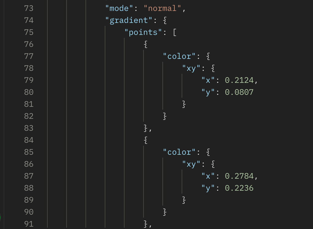
In this list from the V2 API Reference I saw that the gradient strip there are these things called "points" that I imagine are like places on the color map that can be faded between. And there are 5! FIVE! Ah ha! Exactly what I need.

After following the tutorial to set up the V2 version of the API in Postman, I was able to see the points info spelled out from my own Gradient Lightstrip. Gosh I hope this is good news. It seems like the next step is simple - I just have to find a way to PUT my own values there. But this is enough victory for now - going to bed, ending on a high note.
There are 5 points!!!!!
Using color to test the "brightness" concept
After reading through as much as I could, it looks like there is no way to change the brightness of only one of these points. It's frustrating! Why couldn't that be a thing?
But honestly, I can't think of any other use case but this one that would want only part of your light to turn on.... so I can't really blame them.
Starting off: Using Postman and playing with making a rainbow gradient to see how the colors mix when you send 5 values to the strip:
PUT:
{"gradient": {
        "points": [
            {
                "color": {
                    "xy": {
                        "x": 0.3445,
                        "y": 0.1488
                    }
                }
            },
            {
                "color": {
                    "xy": {
                        "x": 0.6385,
                        "y": 0.325
                    }
                }
            },
            {
                "color": {
                    "xy": {
                        "x": 0.4772,
                        "y": 0.4567
                    }
                }
            },
            {
                "color": {
                    "xy": {
                        "x": 0.2823,
                        "y": 0.5881
                    }
                }
            },
            {
                "color": {
                    "xy": {
                        "x": 0.1547,
                        "y": 0.1062
                    }
                }
            }
        ]
    }
}
It looks really pretty!
So, next, at least as a proof of concept, I'll try to mimic the "bright" area with one color and the "regular" area with another.
I used the HUE app to set the colors that I liked using their cherry picker, then did a GET request to see what they are in the xy color space. Here are a few pretty colors to remember and try:
RED
{"color": {
"xy": {
"x": 0.6866,
"y": 0.3107
}
} },
GREEN
{
"color": {
"xy": {
"x": 0.1862,
"y": 0.6878
}
}
},
WHITE
{
"color": {
"xy": {
"x": 0.3159,
"y": 0.3326
}
}
},
DIMMEST LOOKING TO MY EYES: DARK BLUE
{
"color": {
"xy": {
"x": 0.1535,
"y": 0.059
}
}
},
Here's an example of the lights being "whiter" over the sink (in point 2 of the 5 point gradient). It's not perfect, but it's something.

I'm still heartbroken that brightness is inaccessible to only part of the strip. Hmph.
This is making me realize how important getting the current state of the lights will be to the project. If I can get that, then I really don't need a dimmed state, but having the lights overhead turn to the whitest color will in fact provide more light - and a better light temperature too. For example, I cut an Avocado the other day with blue tinted lights and I had no idea if it was ripe enough, so I walked over to my white-light desk lamp to check it (it was good!) but I never would have known that under the colored lights.
So small victory? Eh, I really wish I could control the lights individually like neopixels.


